2022 GMTK Game Jam
This jam can be viewed here.
The Prompt
At 12:59 PM, myself and 10 other unreal developers were gathered in a call, Game Maker’s Toolkit Livestream loaded and watching. Right at 1, the stream begins and announces the theme of this weekend’s jam: Roll the Dice. Immediately ideas are thrown out and discussed. Connections to D&D, binomial distributions, and wagering are all talked about, but 10 people’s different visions can be a bit difficult to reconcile. After a few hours of discussion, we elect to lean into the random novelty aspect of dice by developing a game around the Dice Sword! A wonderful model sketched by one of the team members, the Dice Sword is a sword made of dice, each of which has different effects when rolled that modify player’s abilities. This system was then placed in a wave-based arena slasher, a genre many of our programmers had experience with.
The Logo

The goal of the logo was to grab the viewer’s attention, as well as describe the game as efficiently and as aesthetically as possible. Fortunately, one of the team members thought of the fitting pun, Slice n Dice for the game. I elected to go with a word-based logo, instead of an icon or image-based design for both communication’s and time’s sake. The communication means that a viewer can see this logo and immediately know what going on. No abstraction required.
Casino font seemed like an obvious choice. Slab serifs seem commonplace in the casino aesthetic, they are often seen on playing cards as well, but the casino font itself has inner circles that look like lights from a sign on the Vegas strip. This accentuates a glow effect which can further add to the neon sign above the strip style. Take that, arrange the lettering well, and add in a badass silhouette of the game’s iconic sword, complete with the concentric circles matching the rest of the logo, and we have an eye-catching, thematically coherent logo ready to go.
I will add though, that this is a logo good for a two-day game jam, not a commercial release. A full commercial product would likely have a red undertone on the lettering, as well as on the lights. The glow effect would be worked on more as well, making it smoother and more realistic.
Navigation
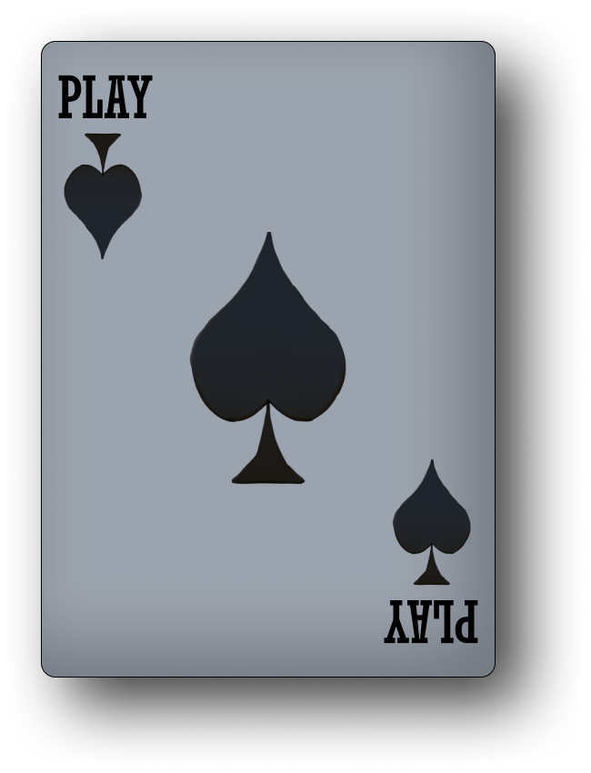
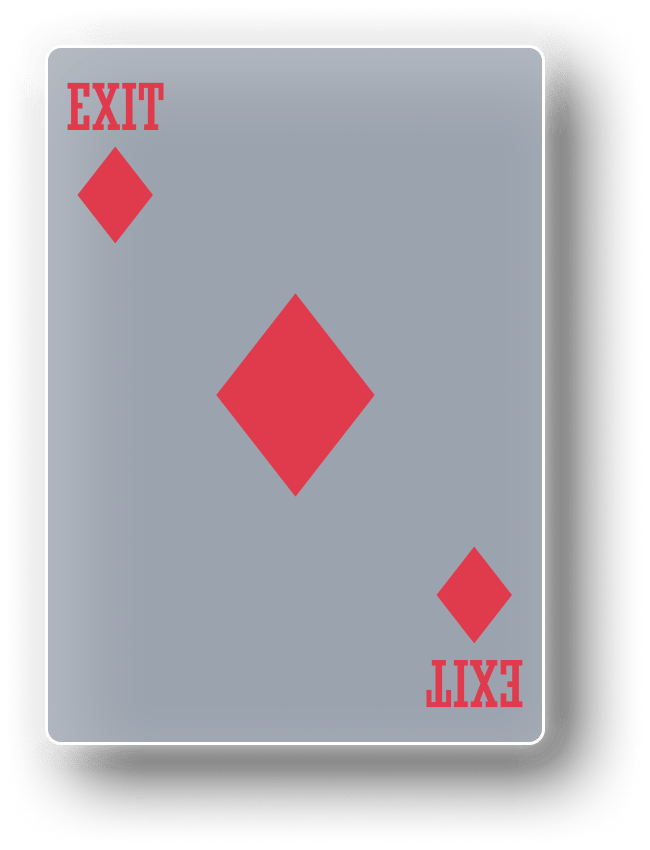
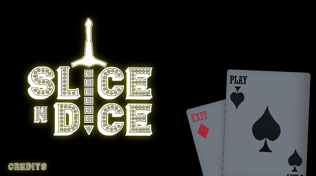
Creating immersive menus is always a priority in UI design. However, a thing to consider when developing for a game jam is the unique audience you are designing for, an overstimulated one. The typical game jammer probably just uploaded their work after long hours, maybe just getting in under the deadline, and maybe they are willing to browse under the jam tag, looking through thumbnails and ratings to pick a couple games to try for a few minutes max. Taking this into account, I decided to emphasize flashiness and uniqueness over ease of use. Players will click on the unique thumbnail and when they open up that main menu and see the “Play” and “Exit” cards in place of default asset buttons, they will immediately see this game as memorable. Hovering over the cards, the same aesthetic as the enemies in the game, all with a glow and slide-out animation gives responsiveness to the player, keeping them immersed while still communicating the options hovered.
Ultimately, I’m the proudest of these card buttons. I really like how they turned out and the team was ecstatic about them.
The HUD
The HUD had to communicate a few different pieces of information. One was health. The health display was chosen to be displayed by hearts, in congruence with the emblems on the playing card enemies. The simple health system also emphasizes the casual nature of the game. The abilities are also displayed, World of Warcraft style on the bottom of the screen. These icons had to be done very quickly, as the abilities were added in at the last stages of development. That said, some of these icons I’m quite proud of for their minimalism, other ones, however, I’m not. Ideally, the dice sword itself would’ve been able to clearly display its current abilities on the model itself, however, that was out of the scope of this jam.
I was quite happy with this jam. I would’ve liked to have spent more time on the icons and added a complete options menu. Perhaps a more complete score system with a complementary display screen.
The itch.io page can be found here.
