

The Design Process
Ever since I opened my first Pokemon booster pack as a kid, I’ve always been a fan of card games. First building a collection of Chaotic cards, to now playing Hearthstone, MTG: Arena, and Legends of Runeterra, I love the sense of novelty, challenge, and tangibility that the trading/collectible card genre offers.
Recently, I decided to put some of my game and graphic design skills to the test and go through the process of developing my own trading cards, beginning with designing the card layout first.
Design Goals and Constraints
The first step in creating cards for a TCG is deciding how the game will be played. Is it a physical card game, with cards being designing to be printed out? Is it a digital card game? Will it be on mobile or PC? This has so much impact on the card construction. If the games on mobile, then you must respect the smaller screen size. If its a physical card, then you must make sure everything a new player needs is one the card. Flavor text, keyword definitions, every aspect of every ability must be spelled out. But I’m going to be building a digital-first, PC card game for this project.
Next, I had to determine what information needed to be displayed on the cards. I want to develop for a Magic or Hearthstone style card game, that being a tempo vs value, separate resource card game with various card types like creatures, spells, weapons, lands and the like. The informational elements that each card will need will be:
1. The cost to play in whatever resource that card needs to be played.
2. It’s name.
3. It’s card type.
4. It’s card subtype.
5. It’s ability text.
6. The card art.
7. A border.
8. The class or color the card belongs to.
9. And what ever type of information the particular card type calls for, like stats for creatures.
Some notable elements I elected to not include in the card are:
Flavor text. Because this is a digital-first game, the flavor text can be placed elsewhere in the game, such as in the collection viewer.
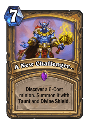
Rarity. Unless cards are printed with gameplay effects that depend on the rarity of other cards. This can also be stored somewhere else in the game. One can say that people like to show off their rare cards in a match, and would like an indication, in match, of their rarity, but I disagree. If you look at Hearthstone, they use a gem in the center of the card to indicate rarity. I’ve never heard of a single player comment on another’s card’s rarity after referencing its gem. What often makes a Hearthstone player impressed with a rare card is the animation it makes when played. More rare cards have cooler, more elaborate animations.
Variants. Card games often employ the use of alternate art styles or holo print versions of cards to add variety, coolness, and value to some of their cards. I did not want to worry about designing alternate versions of cards before I design the original versions, so I didn’t include that in the design requirements. However, after I completed design of the basic versions of cards, I created a few different ways to do variants which will be shown at the end.
The next step was to determine the design goals. Keeping in mind the audience for this game would be experienced PC card gamers who are willing to look for a new indie card game, the core design tenets are:
1. Accessibility. The cards must be legible when in hand and collection.
2. Aesthetic. The cards must look appealing and unique.
3. Minimalistic. The cards must have a minimal design that emphases utility and player experience.
4. Budget. I am not an illustrator, so cards must not require high quality illustrations.
Early Prototypes
To begin, I looked up designing from popular card games and compiled a moodboard.
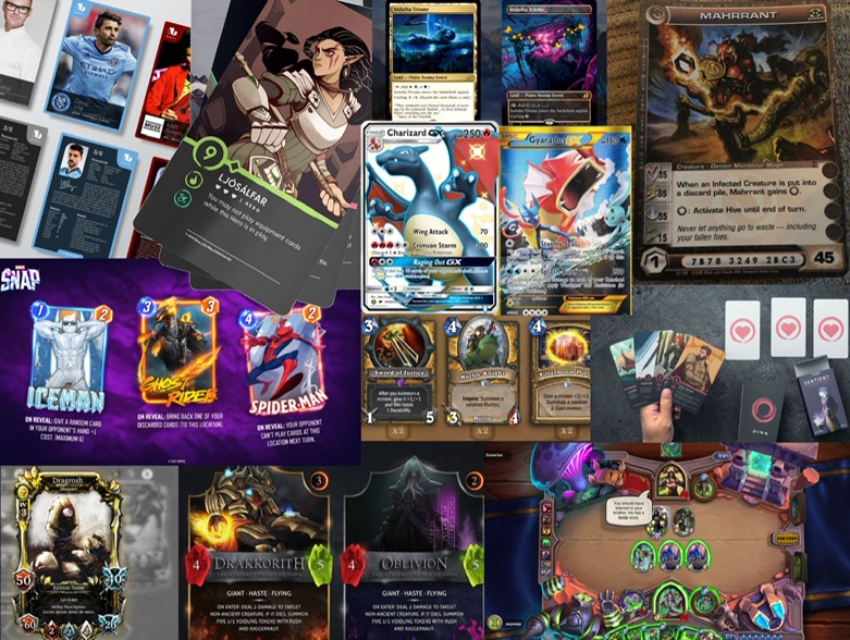
Many of these cards are for entirely different games, but there’s a lot you can get from seeing different designs. Right of the bat I notice that the cards in the bottom left, the ones with an overload of visual elements look more unappealing and esoteric. Not an ideal feeling you want a prospective player having. I really like the Dinn card, the one second from left on top. I love the simplicity. The art-then-text style. No border, just art, then beautiful text and icons. The game for my cards however doesn’t have much similarity with Dinn and is closer to Hearthstone or Magic. Marvel Snap is close, however, that is a mobile-first game which does not display as much info on the card itself.
Next I had to address the art issue. With only minimal drawing experience, I’m not at the level where I can just produce my own concept art. So I used Wombo Dream Art, an AI text-to-art generator to create some images. After experimenting with some different keywords, I got a few images that I felt were ready to go. These images are definitely not at the quality of art seen in popular card games, but to be honest, I really like some of these. I think that many could actually be used in a card game, the only problem with this art generator is that the images all look a little too similar to each other. A game with a few hundred cards would be fine, but if you want a thousand plus different cards with different arts, Wombo can’t do enough distinct images for that. But that’s not an issue for a project of this scale.
After getting a look at the market and some inspiration, I got an idea of the card frame that the project wanted. I noticed that the cards that looked the most appealing to me and seemed to get a lot of reaction by their audiences were the cards with big art. Cards like the holo Pokemon GX cards or the alternate Magic cards. The art work for those cards is larger than the standard inner card frame that most cards use. It makes sense that these are the more visually appealing cards, the ones with big art, because the art is the most visually appealing part of the card. In fact, the art’s primary purpose is to look good. So, for this project, I chose to emphasis the art, having it take up as much of the card frame as possible.
Now, the downside to having the card art take up the whole frame is that it can sacrifice legibility and visual hierarchy. However, this can be remedied by using transparent borders or outline on text. For this project, both are needed.
Hearthstone uses icons under some of their elements, like a sword under attack, to add clarity and distinction, but for this project which emphasizes minimalism, the special icons under the stats of the card are too distracting, so I replaced them with a transparent background.
I also moved the information elements to the top and left corners of the card. This is because most players hold cards in their right hand, or at least their digital hand, and play them with their left. When multiple cards are held that way, the bottom right corner becomes obscured by other cards. So the set information, the icon that indicates what set the card is from, something not important in normal gameplay, is in that corner, while the cards stats, which are very relevant, are in the left corner.
Iterating on the Design
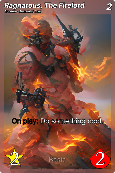
Now that a version of the card has been developed that is, well, sufficient, it’s time to expand upon this design. Immediately, I felt that the header was cramped and the border was restricting the card art too much, so I removed those. I also put a card game background down to get an idea of what the card might look like in a game.
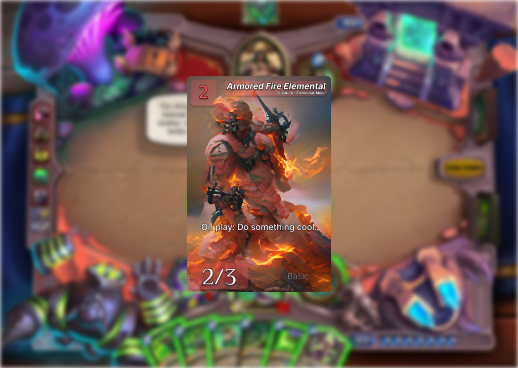
But there is an issue with borderless design. And it has nothing to do with the card itself, rather, how the card visually interacts with other cards. If this game has a set amount of classes or colors that can be its base color for its background/border, like Hearthstone or Magic, then there is often a sense of congruence in the deck building process when building say, a Warlock deck, when all of its cards have a purple background. It feels different than a Hunter deck, where all the cards have a green border. A unified border gives a sense of identity and family to the cards. When I first played Hearthstone, I was immediately drawn to the Shaman class. Why? Because all its cards were blue. With just colored text backgrounds, the player may not get that feeling of a card being part of a bigger set. A deck having that pure sense of being one color, or that menagerie of mixing classes. So I added that border back. But I also played with the header as the fill felt like it could use more depth.
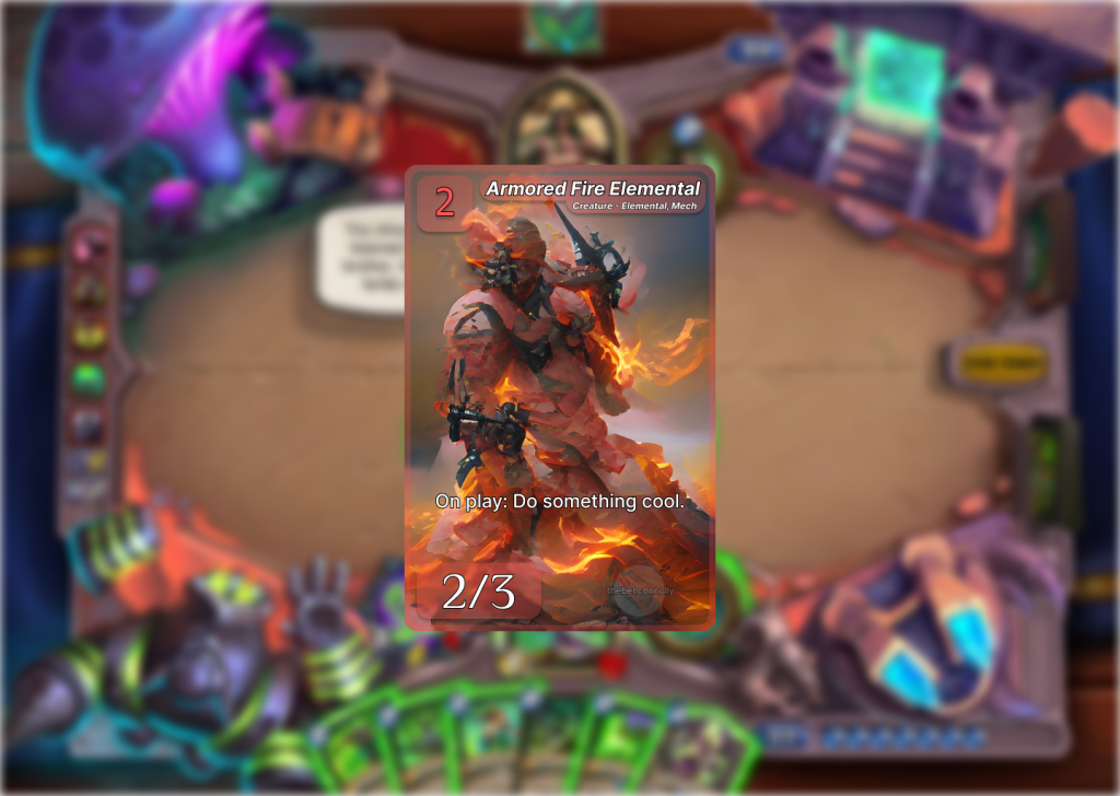
Now this is an appealing design. However, it fails to address one of the project’s design cores: Accessibility. The font is too small. If you compare it side by side to a Hearthstone card, you will see the font size is almost half the size. Unacceptable.

There. Now you can read the card. Well, almost. The text outline is barely noticeable. With no background to distinguish the text from the card art, a large outline is necessary. This is was most apparent when I tried to make a spell card type, so one that has no stats at the bottom, and had very dense art. The need for a bolder text outline is obvious.

Experiments
Now, I feel good with my card frame. And even have one for creatures and spells. However, lets play around a bit and see if we can find something better. And one way to do that is by examining the advantages of your medium. Our medium in this case, is digital. So what digital cards can do that physical cards cannot offer is different views. A card can have a different look when hovered over than not. So lets see what would happen if we made a card that used this.
This looks really good. It allows use to have more of the card art present, while also allowing the user to easily access the information on the card when needed. I still can’t help but feel that the card is too boring though. I made two more versions of this. One with all the information on the bottom, further emphasizing card art, the other adding to the UI elements of the card, by making the background have a glass-like filter instead of a border.
Finalizing Design
Now that I had a few different variants done and a lot of ideas I’d worked with. I could help but noticed that the card design that I was coming back to the most, was not the cool animated card frames, rather it was the first design I felt really good about. I have keep on tweaking and fixing and editing each design to the point where I was just changing things to change them.
I lost sight of the fact that this project was supposed to be “digital-first” not just “digital”. There’s a difference. The project is supposed to allow for physical cards to be printed. Whether for promotional or commercial purposes. The other issue with the animated designs is that viewing the cards in a collection viewer becomes more taxing. Either the player has to scroll over ever card to see its effect or they check a toggle and ever card is flooded with info and the art is all covered, just so the player can see the card effects.
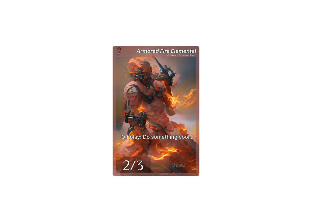
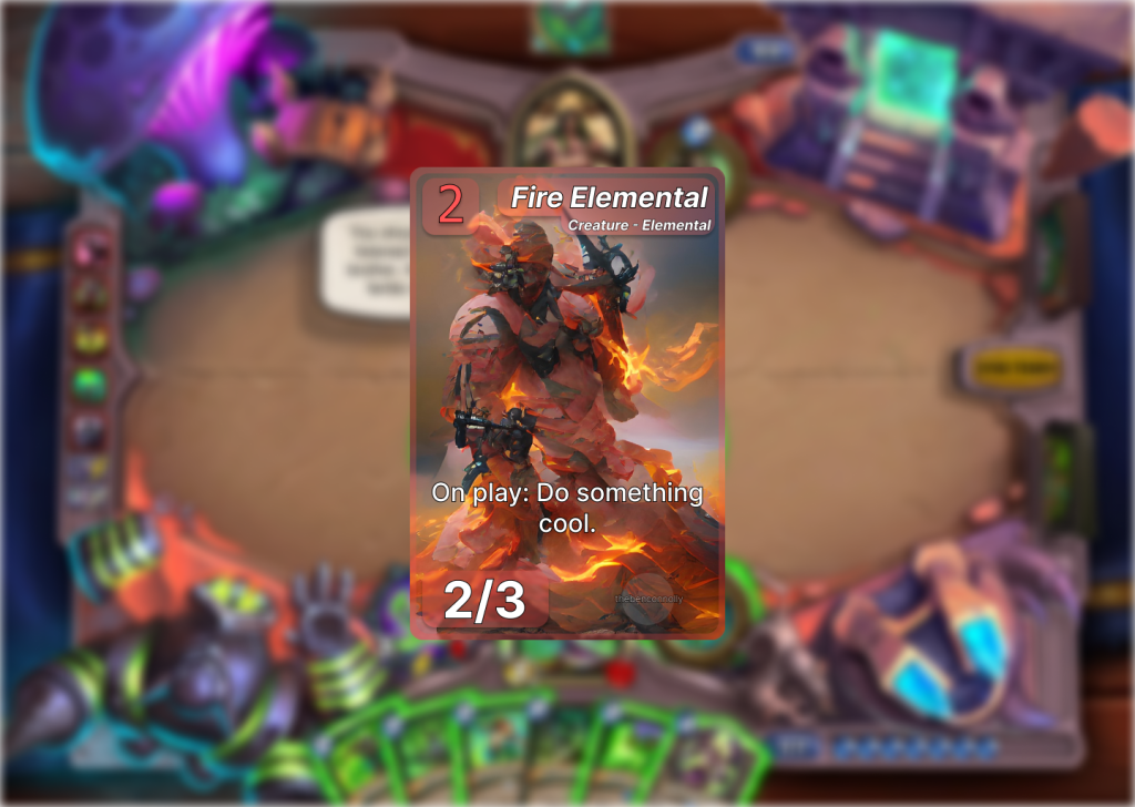
So I went back to the design I liked and used some of the lessons I had learned from the experiments I did. Thicken the outline, add depth to the backgrounds, put the set info watermark behind the text, and lower the card type info. Here’s what I got.

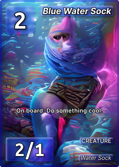
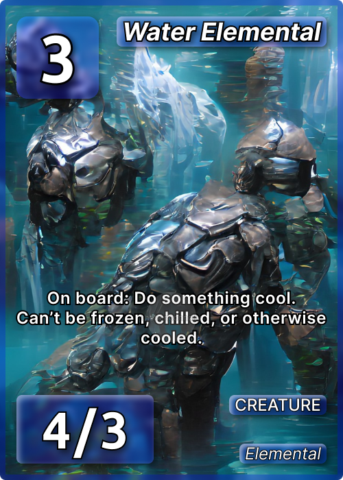
This design meets all our criteria. It’s accessible, minimal, aesthetically pleasing and unique. All information is represented. The card’s art is front and center. The backgrounds look good but aren’t distracting. I feel great about it.
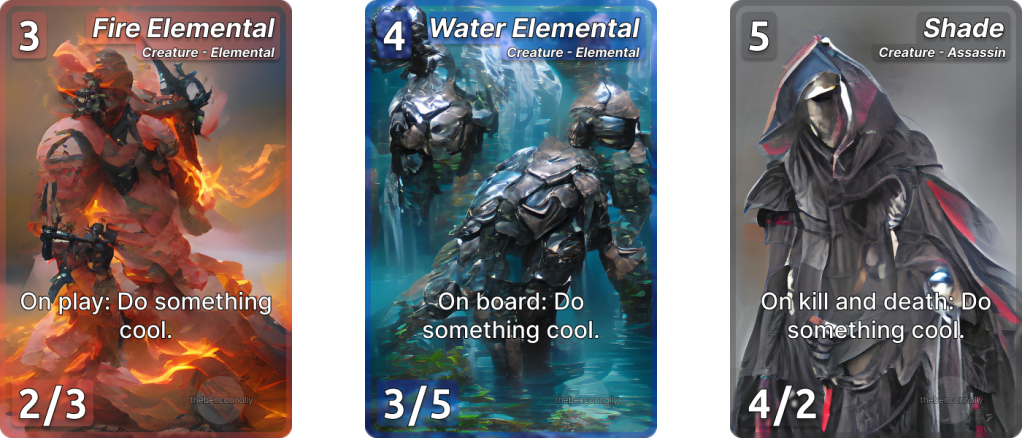
As for different variants of this, one could easily apply a gradient to the color scheme, allowing dual class cards like blue and green. You can also animate the image and you can add complexity to the backgrounds by adding little borders or changing the material, like to a shiny gold for example.
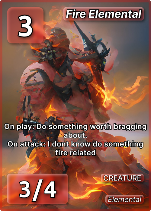
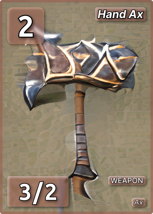
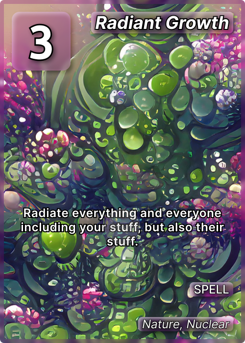
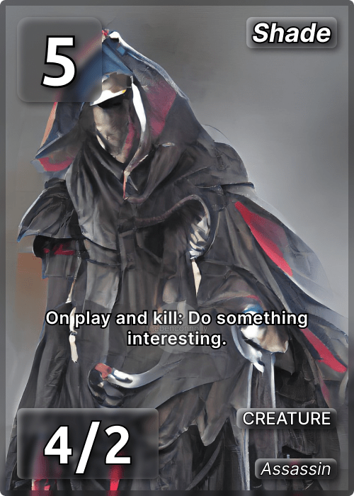
I made a few different card types with this frame. Creatures, spells, weapons, and locations. A couple of those don’t have stats, so that UI element is removed, but I decided to keep the type info right-aligned for those to keep consistency.
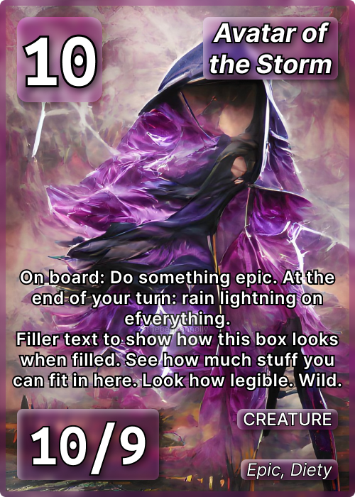
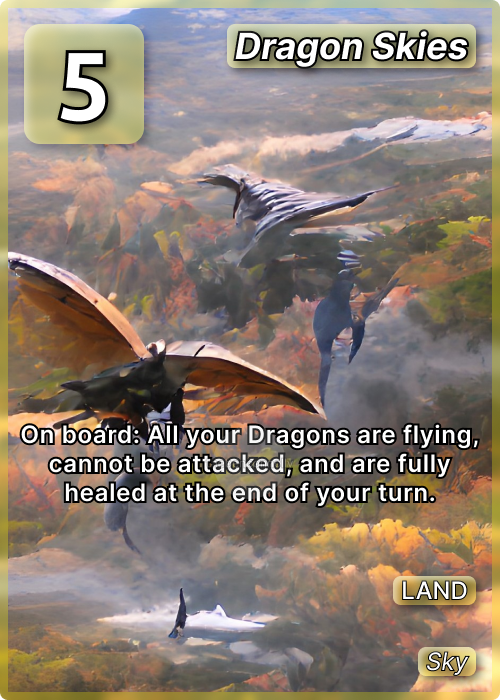
I learned so much going through this process. Going from an idea to a real finished product was educational. There’s differently room for improvement and if I do this again for say, a different card game, I would feel very confident exploring wholly different styles of trading cards. As for this game, I made a few example cards which can be viewed below.

 THE BEN CONNOLLY